Tuesday, 17 February 2015
Evaluation: How effective is the combination of main product and ancillary task?
https://soundcloud.com/simren6/how-effective-is-the-combination-of-our-music-video-and-digipak
Magazine posters are easily received by the audience, due to their use of
colour, scheme and the appearance of a well-known artist; they tend to easily
attract their targeted audience. Certain magazine advert that are well
received, seem to encourage the active audience. Rather than providing all the
details on the advert, excluding the important factors such as the date of
album release, the artist and the album name, it actually encourages the
audience to be active rather than passive. Although an argument perspective
would be that audiences would not bother to fully process the magazine advert,
I find that entirely untrue. I sometimes find myself, coming across a magazine
advert that may be advertising an artist or band that I am fond of and as a
result I start researching songs on the album or additional singles that are
associated with the album that is being released. There is also the essential
factor where audiences have an active mind-set to allow them to draw links.
What I mean by this is, singles tend to be released before the album and those
that tend to feature in the magazine advert have certain similarities and
motifs that allow an association to be made between the single and the poster,
and perhaps the artist and the poster. In my opinion, this is an effective
marketing strategy, with the combination of two media products a music video
and magazine poster starts to enable brand identity of the artist.
Evaluation: What have you learnt from audience feedback?
Obtaining audience feedback ranged from a variety of
different platforms and sharing techniques. There was the use of original 'word
of mouth' asking friends and family to watch the video and share their opinion.
There were social platforms that allowed us to share content, such as Facebook and
Twitter that allowed us to gain feedback from a wider range of people. Surveys
was another method used to obtain research, this guaranteed views and opinions
of our production from anonymous viewers, providing us with a variety of
responses.
Majority of the negative feedback we received
regarding our product commented on the lip sync. They said the lip sync was
noticeably out of sync with the artists miming. It was an aspect of critics
received by almost everyone, and was an aspect I personally believed we could
develop on.
Due to a variety of tastes and opinions, there was a mixture of thoughts on our final product. For instance some people disliked the video style and genre in general, stating their distaste for the product.
Some people enjoyed the production more so than others, taking interest in the artistic style of shots portrayed.
Additionally, another piece of criticism that popped up was the facial expressions. There was a reference to the artist portraying a lack of emotion an aspect that seemed to throw off the audience.
There was also the occasional reference to repetition that seemed to bore the audience to an extent, causing the audiences lack of engagement.
Positive feedback was, in my opinion, more powerful than the negative. There was recurring aspects of the video that the audience were interested in. Majority of the audience commented on the black and white theme being an effective theme that contributed to the video. Many people also liked the black and white against the red colour effect during the bottle smash, stating it was very 'well done'
Many people were extremely pleased with the overlay effect and the camera shots, one viewer described our final product as 'amazing' highlighting the professionalism in the piece.
Monday, 16 February 2015
Sunday, 15 February 2015
Thursday, 8 January 2015
Wednesday, 7 January 2015
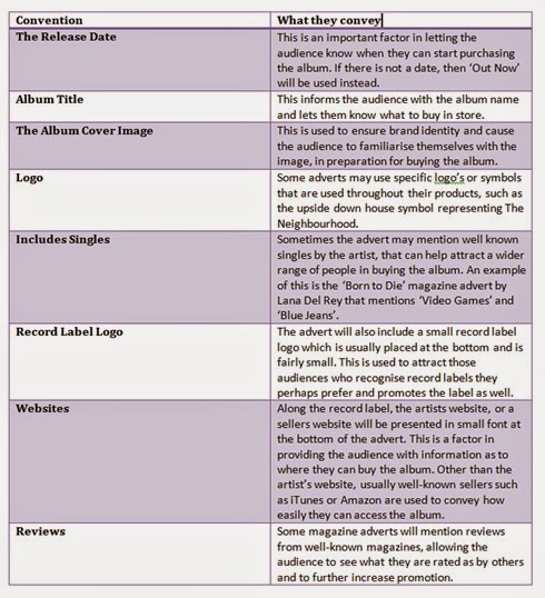
Digipak Research: Conventions of a Magazine Advert
I decided to sum up some of the conventions I found in magazine adverts throughout my analysis and additional research, in a table.
Digipak Research: Useful Information
Album Cover: Back Cover
As agreed, we used our red bottle image and decided we will put the song titles in the middle of the bottle. The image has depth of field which was a factor of the image that really suited as a back cover, once we started placing the song titles across the bottle, it really complemented the image, making it stand out.
The font for this remained the same as I found it was convention, it also well suited the image as it contrasted slightly against the image to be visible, but fit perfectly with the image's depth of field.
We did have the album title at the bottom of the red bottle, however when we received feedback on our product, it seemed too much with the song titles, depth of field and all. so we decided to remove it, very much like the back cover below featuring Taylor Swift 1989
We also followed the convention of displaying a little description along the bottom of the product, featuring the album record information and copyright, as well as a bar code used to buy the product. the professionalism of this product was an achievement we were all proud of, honestly speaking I would definitely buy this album.
Saturday, 3 January 2015
Friday, 2 January 2015
London Grammar- If You Wait
Fonts we liked the best were:
1. Orator Std
2. Blair ITC Light
3. Marquisette BTN Lined
4. Agency FB
In the end we decided to use Blair ITC Light
Subscribe to:
Comments (Atom)


