Thursday, 8 January 2015
Wednesday, 7 January 2015
Digipak Research: Conventions of a Magazine Advert
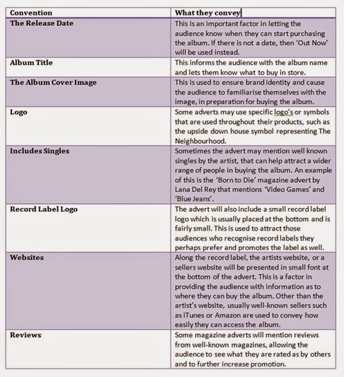
I decided to sum up some of the conventions I found in magazine adverts throughout my analysis and additional research, in a table.
Digipak Research: Useful Information
Album Cover: Back Cover
As agreed, we used our red bottle image and decided we will put the song titles in the middle of the bottle. The image has depth of field which was a factor of the image that really suited as a back cover, once we started placing the song titles across the bottle, it really complemented the image, making it stand out.
The font for this remained the same as I found it was convention, it also well suited the image as it contrasted slightly against the image to be visible, but fit perfectly with the image's depth of field.
We did have the album title at the bottom of the red bottle, however when we received feedback on our product, it seemed too much with the song titles, depth of field and all. so we decided to remove it, very much like the back cover below featuring Taylor Swift 1989
We also followed the convention of displaying a little description along the bottom of the product, featuring the album record information and copyright, as well as a bar code used to buy the product. the professionalism of this product was an achievement we were all proud of, honestly speaking I would definitely buy this album.
Saturday, 3 January 2015
Friday, 2 January 2015
London Grammar- If You Wait
Fonts we liked the best were:
1. Orator Std
2. Blair ITC Light
3. Marquisette BTN Lined
4. Agency FB
In the end we decided to use Blair ITC Light
Subscribe to:
Comments (Atom)


