Wednesday, 24 December 2014

Album Cover: Minor Mistakes (made by yours truly) and Improvements


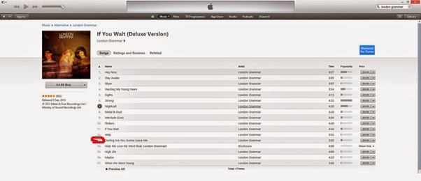
So our experimenting of the day turned into something that would be our final product. We learned a lot of things from out experimental cover, one of which was the album name 'Metal & Dust' that one of us was convinced was the album that had our song in it (guilty as charged). We checked on iTunes and it turned out that 'Metal & Dust' was the EP, and the actual album name was 'If You Wait'


Once we changed that, I was admin on keeping the colour and font size that was used as 'Metal & Dust'. This is because it could be linked back to the sense of 'red' colour that was used in our music video, such as the bottle smashing, and contrasted against the black and white colour scheme, in order to grab the audience’s attention.


Album Cover: Colour, Positioning and Font for 'Metal & Dust'

The album name 'Metal & Dust', I suggested we could put in brick reddish/ brownish colour, the colour of rust. This is because 'Dust' rhymed with rust and it is a chemical reaction that occurs between metal (iron in particular) and water or air moisture well that's the scientific term). But, another significant factor as to why I thought it was a suitable colour to use as the album name was because it acted as a symbolic tool of being the centre of attention, by standing out against the black and white colour scheme, as well as conforming to our music video. Creating a sense of brand identity that linked these two products together.


The positioning was similar to London Grammar, or any artists of this day and age, to be centred in the middle with large capital letters, with the album name underneath it in a smaller sized font.

Although this was an experiment, we achieved progress with our brains combining and possible considered using this idea as our original production.

Digipak Research: Kasabian Empire Album Magazine Advert Analysis


Wednesday, 3 December 2014

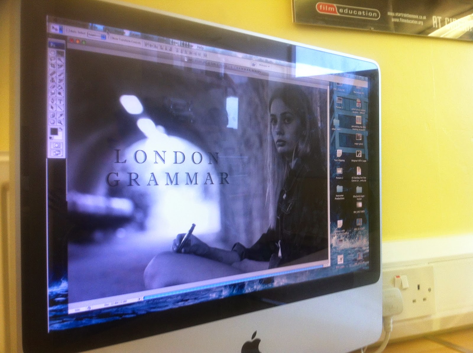
Album Cover: How good does this image look in Photoshop, with the text ofcourse

London Grammar's font used
 

Experimenting with this picture was our starting point for the album cover that we were to produce as our Digipack. So, the artist's name and the title of the album were inserted in accordance to the black and white image itself, bearing in mind the font type London Grammar used.

In order to avoid completely copying the artist’s font type, we decided to start experimenting with different fonts that we thought were similar to the artist, but not entirely the same.

We decided we are going to use this image as our album cover, because of the way our artist was presented. Similar to the 'Meet the Vamps' album cover, our artist breaks the fourth wall by looking directly at the audience a conventional aspect of album covers.


Considered Text